There was a time when designing for desktop was enough. You’d build a website at 1200px width, make sure it looked clean on a laptop, and call it done.
That time is long gone.
Today, users switch between phones, tablets, laptops, smart TVs, and everything in between. They expect your website to work perfectly on all of them. Not “acceptable.” Not “usable.” Perfect.
That’s why responsive design matters more than ever.
Let’s break it down properly.
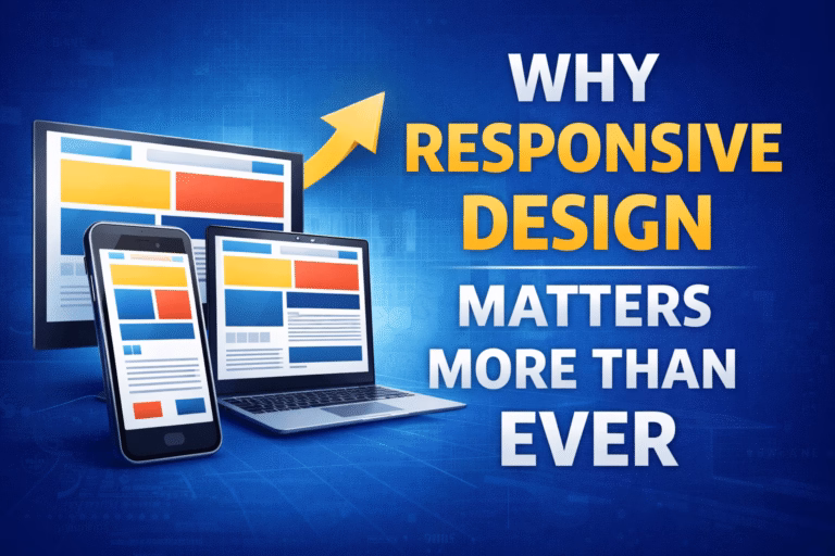
What Is Responsive Design, Really?
Responsive design means your website automatically adapts to different screen sizes and devices. Layout, images, text, and navigation adjust dynamically so users get the best experience regardless of screen width.
Instead of building separate websites for desktop and mobile, you build one flexible system using:
- Fluid grids
- Flexible images
- CSS media queries
- Mobile-first structure
It’s not just about shrinking content. It’s about redesigning the experience based on context.
Mobile Traffic Dominates the Internet
Here’s the reality: more than half of global web traffic comes from mobile devices.
People shop on their phones.
They read blogs on their phones.
They book services on their phones.
If your site looks broken on mobile, users won’t complain. They’ll just leave.
And once they leave, they rarely come back.
User Experience Is Everything
Here’s the thing — users don’t think about “design.” They think about ease.
Can they:
- Read text without zooming?
- Tap buttons easily?
- Navigate without frustration?
- Load pages quickly?
If the answer is no, they bounce.
Responsive design ensures:
- Text is readable
- Buttons are thumb-friendly
- Navigation is intuitive
- Layout feels natural
A smooth experience builds trust. And trust drives conversions.
Google Prioritizes Mobile-First Indexing
Search engines have adapted to user behavior.
Google uses mobile-first indexing. That means it primarily evaluates the mobile version of your website when determining rankings.
If your mobile site is poorly structured, slow, or incomplete, your SEO suffers.
Responsive design supports:
- Better crawlability
- Lower bounce rates
- Improved Core Web Vitals
- Stronger search visibility
In short, responsive design directly affects your rankings.
Conversion Rates Depend on It
Think about e-commerce.
A user clicks your ad on Instagram. They land on your product page. The layout is messy. Images overflow. The checkout button is hard to tap.
They close the tab.
Now imagine a clean, responsive layout:
- Large product images
- Clear call-to-action
- Simple checkout
That’s the difference between lost revenue and a completed sale.
Responsive design removes friction. And reducing friction increases conversions.
It Future-Proofs Your Website
Devices change constantly.
New screen sizes appear every year. Foldable phones. Ultra-wide monitors. Tablets with hybrid modes.
If your site is rigid, it breaks with every new device category.
Responsive design uses flexible structures, so your site adapts automatically. It’s not just about today’s devices. It’s about tomorrow’s.
That’s long-term thinking.
Maintenance Becomes Easier
Managing separate desktop and mobile versions is inefficient.
Two codebases.
Two updates.
Two sets of bugs.
Responsive design gives you one unified system.
You update once. Changes reflect everywhere.
That saves:
- Development time
- Maintenance costs
- Debugging effort
For agencies and business owners, that’s a major advantage.
Brand Perception Is on the Line
Your website is often your first impression.
If it feels outdated or broken on mobile, users assume your business is outdated too.
A responsive website communicates:
- Professionalism
- Modern standards
- Attention to detail
Design influences perception more than people realize.
Responsive Design and Performance Go Together
Mobile users often browse on slower networks.
Responsive design encourages:
- Optimized images
- Lightweight layouts
- Conditional loading
- Efficient CSS
That leads to faster load times.
And speed isn’t just technical. It’s emotional. Fast websites feel trustworthy and reliable.
Accessibility and Inclusivity
Responsive design also supports accessibility.
It allows:
- Proper scaling of text
- Logical content structure
- Touch-friendly interactions
- Better compatibility with assistive technologies
An inclusive design expands your audience and strengthens your brand reputation.
The Cost of Ignoring Responsive Design
Let’s be clear. Ignoring responsive design costs you:
- Traffic
- Rankings
- Sales
- Credibility
- Customer trust
In competitive markets, small disadvantages compound quickly.
If your competitor offers a smoother mobile experience, users will choose them.
Not because they’re cheaper.
Not because they’re better.
But because they’re easier.
Ease wins.
Mobile-First Is the Smart Approach
Modern development often follows a mobile-first strategy.
That means:
- Design for small screens first
- Focus on core content
- Enhance progressively for larger screens
This approach forces clarity.
You prioritize:
- What truly matters
- Clean structure
- Efficient performance
Then you expand features for desktop users.
It creates stronger, leaner websites.
Responsive Design Is No Longer Optional
Years ago, responsive design was a competitive advantage.
Today, it’s a basic expectation.
Users don’t reward you for having it.
They punish you for not having it.
That’s the shift.
If your website isn’t responsive in 2026, it signals neglect.
Practical Tips to Improve Responsiveness
If you want actionable steps, start here:
- Use a responsive framework (like Bootstrap or Tailwind CSS)
- Implement flexible grid systems
- Test on real devices, not just browser tools
- Optimize font sizes and spacing for readability
- Ensure buttons meet minimum touch size standards
- Avoid fixed-width elements
- Compress images and use modern formats
And most importantly, test continuously.
Resize your browser.
Use multiple devices.
Ask real users to navigate your site.
Final Thoughts
Responsive design matters more than ever because user expectations have evolved.
People don’t separate desktop and mobile experiences. They just expect consistency.
A responsive website:
- Improves user experience
- Boosts SEO
- Increases conversions
- Reduces maintenance
- Future-proofs your business
What this really means is simple.
If your website doesn’t adapt to users, users won’t adapt to your website.
And in digital business, the user always wins.
Invest in responsive design now. It’s not a trend. It’s the foundation.